2026 Design Trends: Why Branding Finally Feels Alive Again
For the last few years, branding hasn't hit the way it used to. Everything became smooth, optimized, frictionless—and somehow, nothing felt alive. What excites me about 2026 is that this trend is finally reversing.
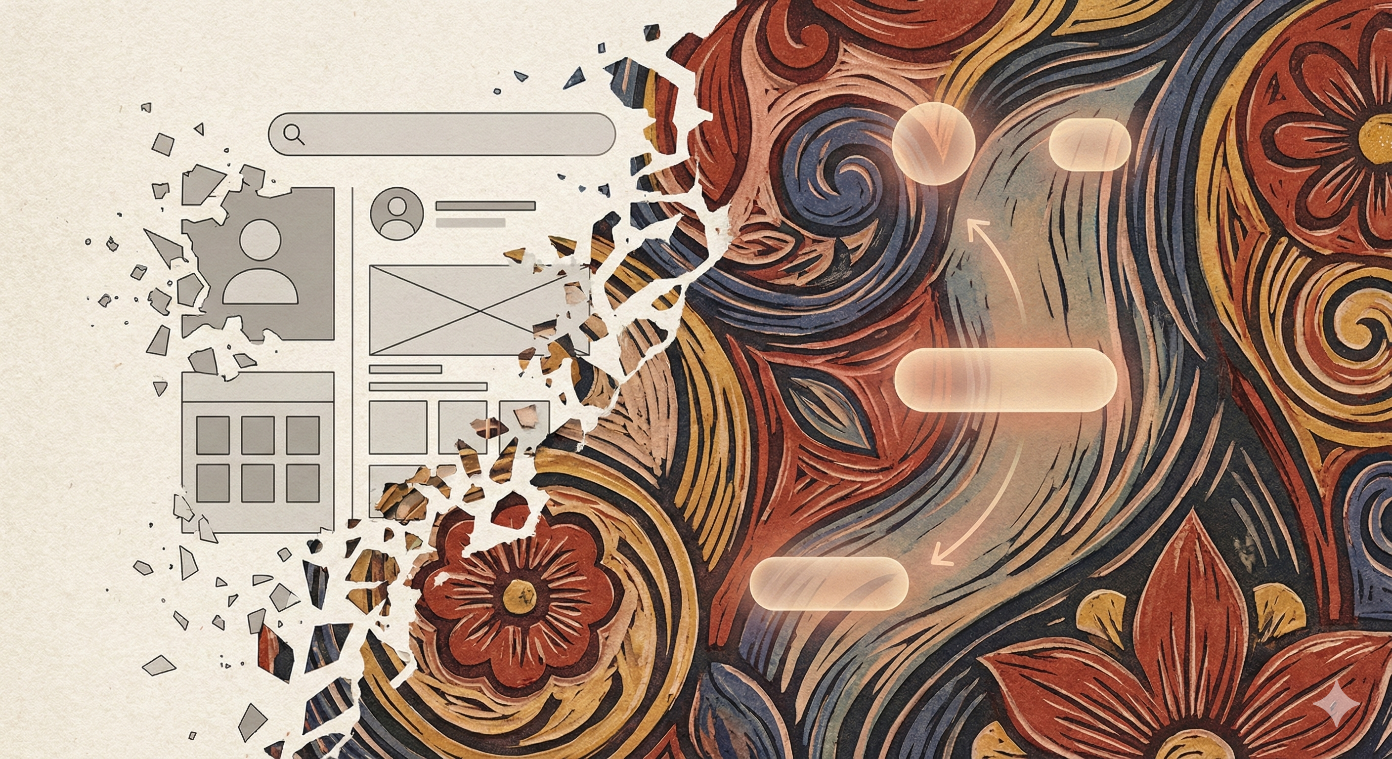
For the last few years, branding hasn't hit the way it used to.
Everything became smooth. Optimized. Frictionless.
Logos were clean. Interfaces were efficient. Color palettes were safe.
And somehow, nothing felt alive.
That didn't happen because designers lost talent.
It happened because emotion was optimized out of the process.
What excites me about 2026 is that this trend is finally reversing—not because AI is disappearing, but because it's changing how creativity shows up.
Summary: Top Digital Design Trends for 2026
- Creative Necromancy: Using AI to revive labor-intensive analog styles like woodblock printing, etching, and linocut that were previously too time-consuming for modern workflows.
- Intentional Friction: Moving away from frictionless UI toward textures, visible imperfection, and grit that imply weight and resistance—proof that something was made, not generated.
- Haptic Web Design: Using sound design and micro-animations to create tactile digital experiences that acknowledge touch, hover, and user intent.
- Narrative Systems: Branding that relies on folklore, mythic symbols, and gothic typography rather than clean minimalism—compressing meaning into emotion.
Human-Centered Revival: AI Didn't Kill Craft. It Brought It Back.
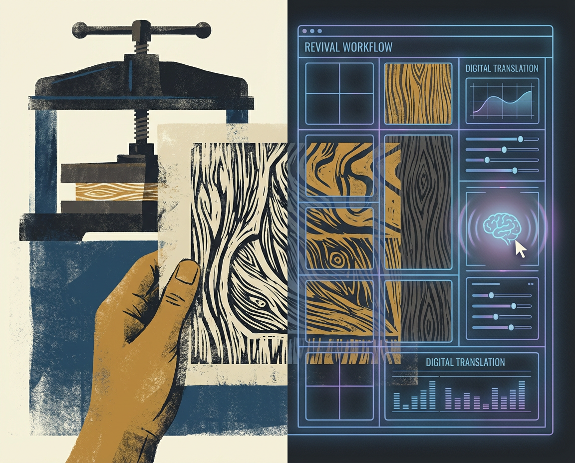
There's a growing backlash against AI-generated sameness, and on the surface it looks like a return to analog skills: linocut, woodblock printing, etching, filigree, gothic typography.
But something more meaningful is happening beneath that reaction.
AI is enabling a human-centered revival of craft—not by replacing designers, but by making emotionally rich, time-intensive art forms viable again inside modern workflows.
These styles didn't disappear because people stopped loving them.
They disappeared because they took too long, required rare skills, and didn't fit modern timelines.
In 2026, AI collapses that gap.
With the right direction, designers can explore woodcut illustration, etched textures, ornamental systems, and folklore-driven typography without weeks of manual labor. What was once inaccessible becomes experimental again.
This isn't automation for speed.
It's technology supporting a return to human intention, imperfection, and emotional weight.
| Design Aspect | The "Clean" Era (Fading Out) | 2026 Design Trend (In) |
|---|---|---|
| Texture | Smooth, frictionless surfaces | Haptic Design & visible grit (paper tears, ink bleed) |
| Color | Neutral, muted, "safe" palettes | Emotional Color & surreal, high-contrast tones |
| Typography | Sans-serif, optimized for screens | Folklore & Gothic (Human, imperfect, historical) |
| Branding | Optimized for efficiency | Narrative Packaging (Story-driven, mythic) |
| Interaction | Silent, standard transitions | Sound Design & tactile micro-interactions |
Branding Lost Its Soul When It Lost Friction
Branding stopped hitting because it stopped resisting.
As systems improved, everything became easier:
- Templates replaced intention
- Consistency replaced expression
- Clean replaced meaningful
Friction used to be part of the signal.
Ink bleed. Uneven cuts. Imperfect symmetry.
These weren't flaws—they were proof that something was made, not generated.
In 2026, friction is returning on purpose.
Scanned textures. Paper tears. Grit. Visible imperfection.
If something looks too clean now, it reads as artificial.
The irony is that AI enables this return.
It handles precision so designers can focus on mood, symbolism, and emotional weight again.
2026 Graphic Design Trend: Emotional Color Is Back
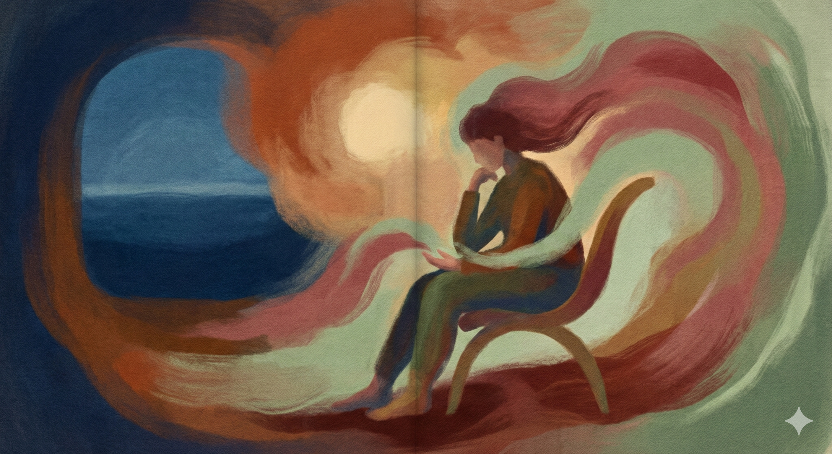
Another shift that stands out is the return of emotional color.
For years, branding lived in a safe zone: muted palettes, neutral gradients, professional restraint. It was inoffensive—but also forgettable.
Now we're seeing expressive, sometimes surreal color choices return:
- Warm, human tones that feel comforting
- High-contrast palettes that feel electric or chaotic
- Colors chosen for emotion, not just optimization
This isn't about trend cycles.
It's about restoring feeling to digital spaces that became sterile.
Branding doesn't connect because it's efficient.
It connects because it makes you feel something.
Brand Design Trends: Narrative Packaging Over Visual Systems
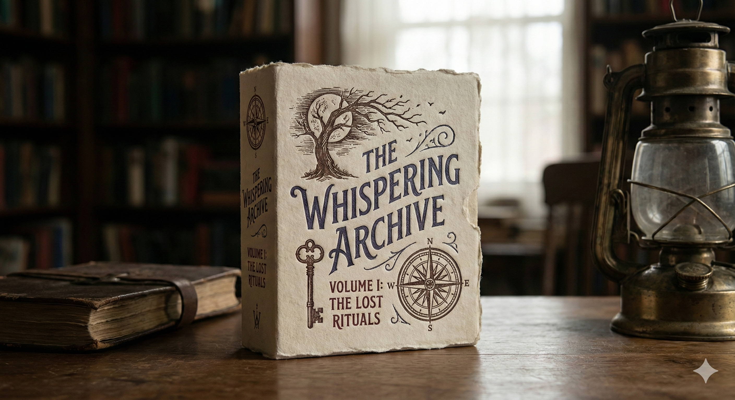
The most compelling brands emerging right now aren't just visual systems—they're narrative systems.
Gothic type. Folklore imagery. Mythic symbols. Esoteric patterns.
These elements work because they imply story without explaining it.
Narrative packaging compresses meaning into emotion.
You don't need to understand it—you feel it.
That's why these older styles are resonating again. They feel older than the internet. Bigger than trends. More human than dashboards and UI kits.
AI can support this at scale—but the narrative still has to come from a person.
Web Design Trends: Tactile Comfort & "Haptic" Feedback
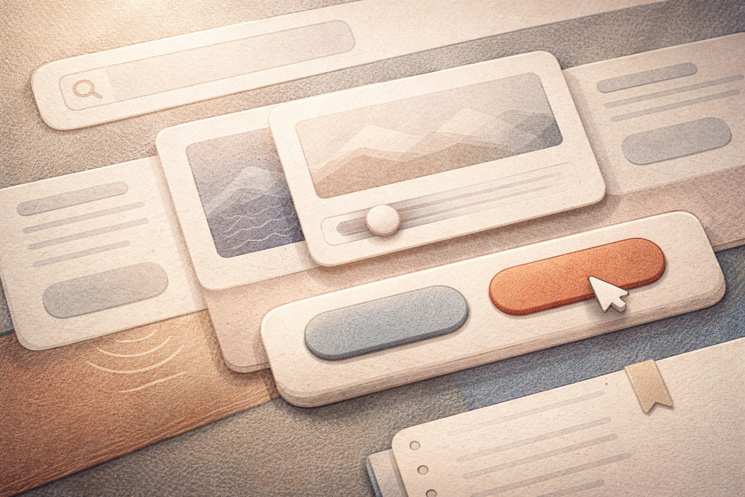
One of the final shifts I'm paying close attention to is tactile comfort—the emotional response we get from surfaces, texture, and sound, even on a flat screen.
As interfaces became more minimal, they also became more sterile.
Smooth cards. Silent clicks. Identical transitions.
Nothing pushed back. Nothing responded.
In 2026, brands are reintroducing sensory cues that make digital experiences feel grounded and intentional.
This shows up in small but powerful ways:
- Subtle material textures that imply softness, weight, or resistance
- Buttons that feel pressable rather than purely visual
- Micro-interactions that acknowledge touch, hover, and intent
- Thoughtful sound design—notification pings, toggles, and clicks that feel warm and human instead of sharp or system-default
These details shape how a user feels while exploring a website, even if they can't consciously explain why.
Sound, in particular, is becoming an emotional layer of branding again. A single interaction tone can communicate calm, urgency, or trust faster than copy ever could. When done well, it doesn't draw attention—it simply makes the experience feel alive.
This isn't about visual gimmicks or fake realism
It's emotional feedback—letting the interface acknowledge the user's presence.
What I'm Working On Next
Over the next few weeks, I'll be researching and implementing many of these ideas across lopezproductions.ai.
That includes:
- Exploring AI-assisted craft styles like linocut and woodblock
- Introducing more intentional texture and material cues
- Refining motion and interaction feedback
- Experimenting with subtle, brand-safe sound design
I'll be sharing before-and-after comparisons as I go—not as a reveal, but as an open experiment.
If 2026 branding is about anything, it's this:
Design that doesn't just look good—but feels considered, responsive, and alive.
🗂 Related Articles
Ready to Build Your Brand System?
If you're a creator or small business looking to build a brand system that feels alive, I can help you implement these 2026 design trends into your own website and visual identity.